By Hailey Salvian, Shayna Goldman and Sean Gentille
We waited more than a year for proper PWHL nicknames and logos. Now that we have them, courtesy of Monday’s official unveiling, we’re not going to waste any more time.
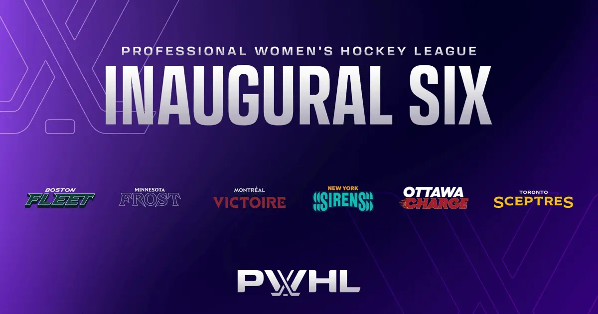
Which of the six new combos — the Boston Fleet, Minnesota Frost, Montréal Victoire, New York Sirens, Ottawa Charge and Toronto Sceptres — is our No. 1? How do the rest measure up?

GO DEEPER
PWHL unveils team names and logos: ‘We just couldn’t be more thrilled’
The Athletic’s Hailey Salvian, Shayna Goldman and Sean Gentille teamed up for the definitive ranking.
1. Montréal Victoire
Hailey rank: 1
Sean rank: 3
Shayna rank: 1
Shayna: Everything about Montreal’s look and branding just clicks. Victoire just feels fresh relative to other names associated with Montreal hockey in the past (and present, really). It’s something that works for both French and English speakers, too. The maroon of the color scheme feels grand enough to match the energy that the name brings, and using cream over white adds a classic touch. The navy completes the look and accents the logo. I have nitpicks here or there with the rest of the teams, so the combination of the name and logo makes this an easy No. 1 for me.
Hailey: I was surprised at how much I liked Montreal, considering I wanted the league to go back to Les Canadiennes from the CWHL days. Regardless, Montreal has the best combination of name and logo, which is why it gets the edge over New York and Toronto for me. There’s more detail to appreciate in the Montreal logo specifically, with the fleur-de-lis and the hidden M toward the bottom. “Victoire” is also just a cool name to have for a team with the most clutch player in the history of the women’s game.
Sean: I almost feel bad having them at No. 3. Shayna and Hailey are correct about everything. I really appreciate the freshness of the package — if this one isn’t groundbreaking, it’s pretty close. Also, the logo looks like a diamond! Nobody else said that!
2. Toronto Sceptres
Hailey rank: 3
Sean rank: 2
Shayna rank: 2
Hailey: If you asked me immediately after the PWHL announcement, I’d probably have “Sceptres” lower than No. 3 and maybe I was just being a picky local because I can see Coca-Cola Coliseum from my apartment. But Toronto’s logo might be my favorite of the six and the name is really growing on me – if nothing else it’s certainly unique. The colors look great, and I do think a team like Toronto – with fans who dressed up as spoons and nurses last season – could have a lot of fun with this. Sarah Nurse literally has a brand with the motto “Queen Energy Only.”
Shayna: Absolutely yes to the logo and to the color scheme. The name just … I need some time with this one. The Toronto teaser tweeted out the other day made me think “Royals” or “Monarchs” was the direction here, and I think either of those would have slapped. Sceptres isn’t a bad name and it’s unique to a sports team, it just doesn’t roll off the tongue yet.
Sean: I didn’t like the nickname initially — like, at all — but it grew on me pretty quickly … if we’re grading on a curve. I don’t love a monarchy; Canadian money bothers me for this reason. Still, points for creativity, the originality of a navy-light blue-gold combo and the best logo of the bunch. It’ll sell well with Taylor Swift fans.
Hailey: I didn’t even consider that. Sean might be the biggest Swiftie of the group!
3. New York Sirens
Hailey rank: 2
Sean rank: 1
Shayna rank: 6
Sean: I’m hard to please when it comes to team names. I don’t like collective nouns (i.e., “Kraken”), but I’m also not looking for more Panthers or Vikings. That’s a small sweet spot, and nobody hit it more directly than the Sirens. The logo isn’t my favorite — something about the way the wordmark halves the Y — but I think it’ll pop as a center crest.
The main reason I have them in my top spot: I don’t think any name-logo combo is more cohesive. “Sirens” works as a reference to hockey, yes, but also Long Island Sound, and I continue to love that shade of teal, especially in concert with the New York Liberty and Gotham FC. It’s the total package.
Hailey: I was Team New York Sirens until my last-minute swerve to the Montreal bandwagon. I think the name Sirens is my favorite, but the Montreal logo was the tie-breaker in my ranking. The colors are great, and the synergy with women’s sports in the tri-state area is a nice touch. This team has a lot of potential with in-arena activations, too. Can we get a giant siren?
Shayna: I absolutely love New York leaning into teal to stay consistent with the Liberty and Gotham FC. But the name is a no from me. I know it’s probably a reference to the water, but my immediate thought was: “We get it, New York’s loud with a lot of sirens.” I actually would prefer the Sound, which was one of those original trademarks leaked last year. That made sense for a team that bounced among New York, Connecticut and New Jersey. As for the logo – remember the Superman S you probably sketched on your notebook in middle school? This feels like a dressed-up version of that.
4. Boston Fleet
Hailey rank: 4
Sean rank: 4
Shayna rank: 3
Sean: I had a pretty defined top three and bottom three — half the brands seem to be going for one thing, and half another — and Boston was the best of the second batch based largely on the logo. It helps that the letter ‘B’ looks so much like a fishhook, but credit where it’s due. I also spy a bit of a Hartford Whalers reference, if you look from the side. Is that me projecting? Perhaps. In any case, it’s fine. A little uninspired, but fine. As for the name, I don’t like “Fleet,” but I also dislike it less than the other (Anglo) collective nouns.
Hailey: While Boston is a tier below Montreal, New York and Toronto, it’s also the best of the rest for me. The logo is far superior to Ottawa and Minnesota – the details inside the B and the anchor shape – though I like the “Charge” name more than “Fleet.” I can’t imagine it’s easy developing a sports brand in a city with the Red Sox, Bruins and Celtics, but this is a nice entry.
Shayna: Boston may have one of the coolest logos here, which really boosts its ranking. The anchor-like B is just so sharp. If that W is an intentional reference to the Whalers, I like it even more as a way to celebrate New England hockey in the post-Connecticut Whale era. The name I was initially sour on, but it’s not that bad. It’s a nice nod to Boston’s history and overall being a major seaport.
5. Minnesota Frost
Hailey rank: 5
Sean rank: 5
Shayna rank: 5
Shayna: I was really rooting for the “Reign” here with the purple scheme as a nod to Prince, but this isn’t a bad direction. The Minnesota Frost is honestly a pretty sick name that makes a lot of sense for a hockey team without being too cheesy and literal. The reason they don’t rank higher isn’t because the other teams are all so incredible that it was a process of elimination. The logo just falls short and drags the entire branding down. The ‘F’ is a promising start, but feels so incomplete.
Sean: This feels more like a create-a-team template than any of the others. I guess the negative space creates a mountain, which … it’s something. Points for purple.
Hailey: More than the other teams, Minnesota feels like a victim to the legal process when it comes to naming sports teams in 2024. The Ontario Reign already exist in the AHL, and the league clearly wanted new names it could fully own. I honestly don’t dislike the Frost – or any of the names for that matter – and I love the colors, but I can’t stop thinking about the F being on a cartoon superhero. I thought it was Frozone, but he doesn’t wear purple.
6. Ottawa Charge
Hailey rank: 6
Sean rank: 6
Shayna rank: 4
Shayna: Ottawa is very middle-of-the-road for me. I think the more I look at it, the more I find flaws with it. The color scheme doesn’t reinvent the wheel, but red-yellow-white is bright and eye-catching on the ice which I can appreciate. But I second what Sean said earlier on collective nouns for team names. And the logo (plus the color scheme) is giving knock-off Calgary Flames. I do love the Flames look and logo, so it’s not necessarily a bad thing. It just isn’t my favorite!
Hailey: I honestly don’t have strong feelings about Ottawa: The name works well enough for me, and the logo is fine. The whole electric charge vibe would have been cool if Daryl Watts was still on the team. Too soon! I’m sorry!
Sean: “Go Charge Go” is going to be a great arena chant, but the rest of it looks way too close to a software company logo from, like, 1997 for my taste. Sorry.
(Images courtesy of PWHL)


